Dplyr, tidyverse, ggplot, and t-test (using bootstrap).

After cleaning and performing an exploratory data analysis on multiple data sets, ggplot was used to visualise and gather information about the spread of the data. Inferences were made from various types of plots and numerical relations (e.g. correlation).
Setting up the file to auto filter the data and plots
Loading the necessary libraries
Ananlysis 1 on Climate change and temperature anomalies
Loading the data
weather <-
  read_csv("https://data.giss.nasa.gov/gistemp/tabledata_v4/NH.Ts+dSST.csv",
           skip = 1,
           na = "***")
Tidying the data
tidyweather <- weather %>%
  select(1:13) %>% #Selecting Year and month variables
  pivot_longer(cols=2:13, names_to='month', values_to='delta') #Tidying the data from wide to long format so that we have a column for the months and the corresponding temperature data respectively
Checking for year, month, and delta columns in the tidyweather dataframe
skim(tidyweather)| Name | tidyweather |
| Number of rows | 1704 |
| Number of columns | 3 |
| _______________________ | |
| Column type frequency: | |
| character | 1 |
| numeric | 2 |
| ________________________ | |
| Group variables | None |
Variable type: character
| skim_variable | n_missing | complete_rate | min | max | empty | n_unique | whitespace |
|---|---|---|---|---|---|---|---|
| month | 0 | 1 | 3 | 3 | 0 | 12 | 0 |
Variable type: numeric
| skim_variable | n_missing | complete_rate | mean | sd | p0 | p25 | p50 | p75 | p100 | hist |
|---|---|---|---|---|---|---|---|---|---|---|
| Year | 0 | 1 | 1950.50 | 41.00 | 1880.00 | 1915.00 | 1950.50 | 1986.00 | 2021.00 | ▇▇▇▇▇ |
| delta | 4 | 1 | 0.08 | 0.47 | -1.52 | -0.24 | -0.01 | 0.31 | 1.94 | ▁▆▇▂▁ |
Plotting Information
#Creating date variables for the tidyweather dataset
tidyweather <- tidyweather %>%
  mutate(date = ymd(paste(as.character(Year), month, "1")), #Creating a column called date
         month = month(date, label=TRUE), #Converting month column into an ordered date factor
         year = year(date)) #Converting the Year column into an ordered date factor

#Plotting temperature by date
ggplot(tidyweather, aes(x=date, y = delta))+  #Plotting delta by date
  geom_point()+ #Scatterplot
  geom_smooth(color="red") + #Adding a red trend line
  theme_bw() + #theme
  labs (#Adding a labels
    title = "Weather Anomalies",
    x = "Date",
    y = "Delta"
  ) +
  NULL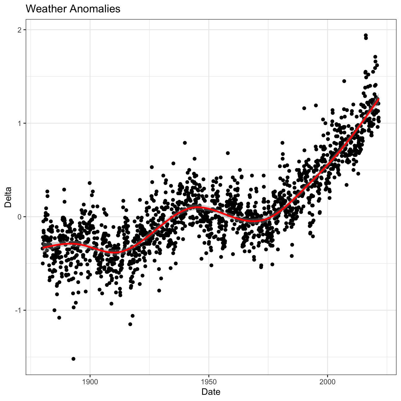
Scatterplot for each month
tidyweather %>%
  ggplot(aes(x=Year, y=delta)) + #Plotting delta by Year
  geom_point() + #Scatterplot
  geom_smooth(color="red") + #Adding a red trend line
  theme_bw() + #theme
  facet_wrap(~month) + #Creating separate graphs for each month
  labs (#Adding a labels
    title = "Weather Anomalies per Month",
    x = "Year",
    y = "Delta"
  ) +
  NULL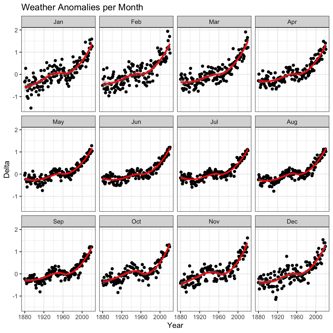
Inference 1: Although all of the graphs in the grid have a similar upwards trend, there are subtle differences in variability between months such as December/January and June/July. January is a month with much higher variability in weather while June does not. This is something that may be worth looking into for meteorologists.
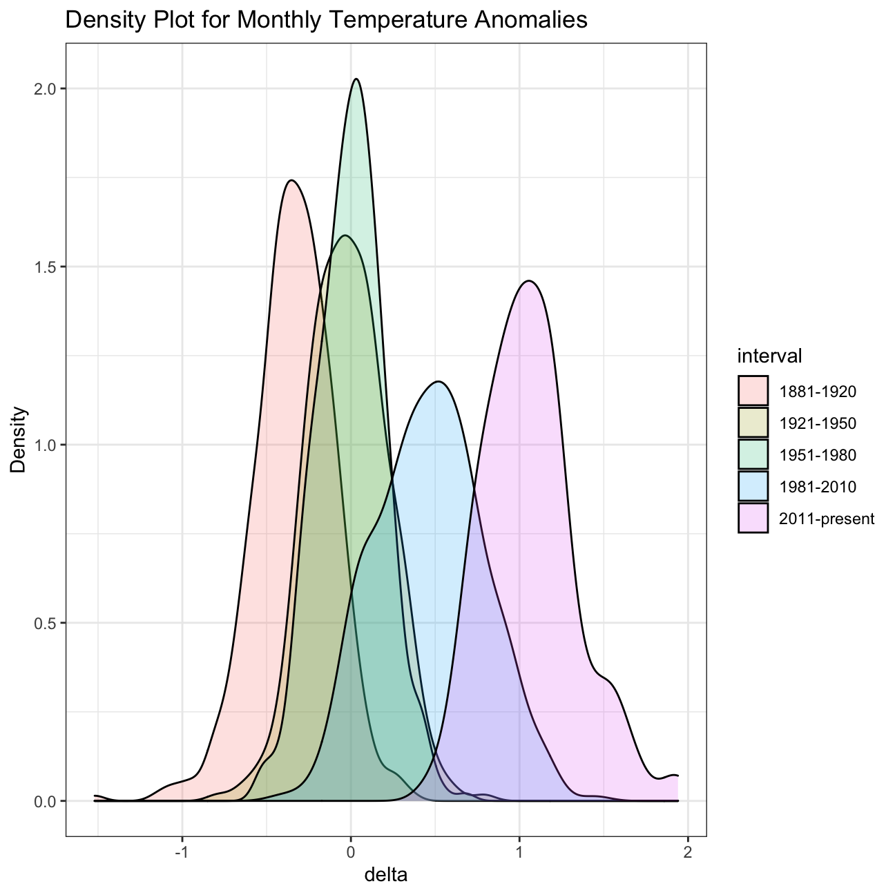
Creating an interval column for 1881-1920, 1921-1950, 1951-1980, 1981-2010
comparison <- tidyweather %>% #New data frame called comparison
  filter(Year>= 1881) %>%     #remove years prior to 1881
  #create new variable 'interval', and assign values based on criteria below:
  mutate(interval = case_when(
    Year %in% c(1881:1920) ~ "1881-1920",
    Year %in% c(1921:1950) ~ "1921-1950",
    Year %in% c(1951:1980) ~ "1951-1980",
    Year %in% c(1981:2010) ~ "1981-2010",
    TRUE ~ "2011-present"
  ))
Density plot to study the distribution of monthly deviations (delta), grouped by intervals we are interested in
ggplot(comparison, aes(x=delta, fill=interval)) +
  geom_density(alpha=0.2) +   #density plot with tranparency set to 20%
  theme_bw() +                #theme
  labs (
    title = "Density Plot for Monthly Temperature Anomalies",
    y     = "Density"         #changing y-axis label to sentence case
  )
Average annual anomalies
average_annual_anomaly <- tidyweather %>%
  filter(!is.na(delta)) %>% #Removing rows with NA's in the delta column
  group_by(Year) %>%
  summarise(
    annual_average_delta=mean(delta)) #New column annual_average_delta to calculate the mean delta by year

ggplot(average_annual_anomaly, aes(x=Year, y=annual_average_delta))+
  geom_point() + #Scatterplot of annual_average_delta over the years
  geom_smooth() + #Trend line
  theme_bw() + #Theme
  labs (
    title = "Average Yearly Anomaly", #Title
    y     = "Average Annual Delta" #y-axis label
  ) +
  NULL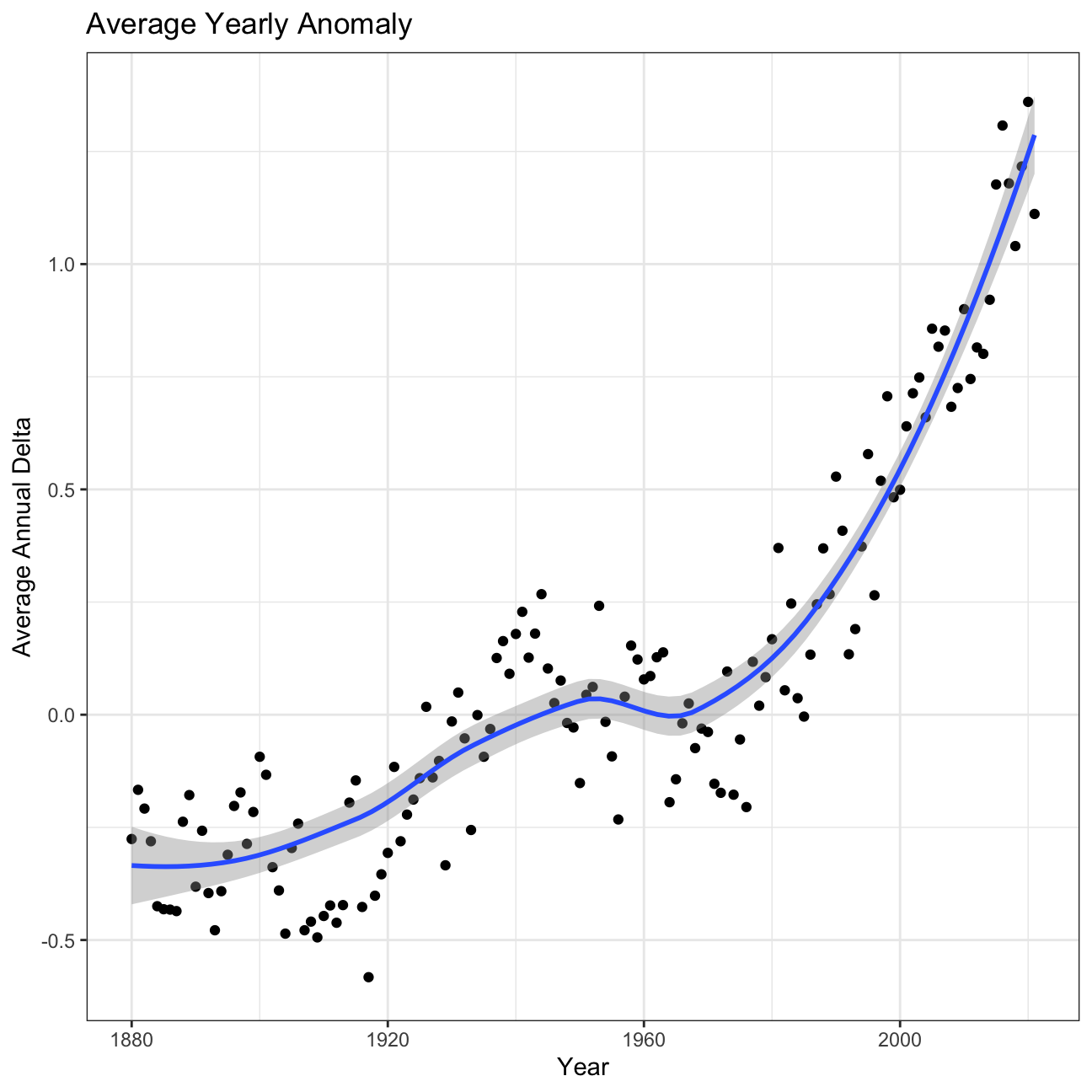
Inference 2: A one-degree global change is significant because it takes a vast amount of heat to warm all the oceans, atmosphere, and land by that much. In the past, a one- to two-degree drop was all it took to plunge the Earth into the Little Ice Age.
Confidence interval for the average annual delta since 2011
formula_ci <- comparison %>%
  group_by(interval) %>%
  # calculate mean, SD, count, SE, lower/upper 95% CI
  summarise(
    mean=mean(delta, na.rm=T), #mean
    sd=sd(delta, na.rm=T), #standard deviation
    count=n(), #number of datapoints
    se=sd/sqrt(count), #standard error
    t_critical=qt(0.975, count-1), #t-critical using quantile function
    lower=mean-t_critical*se, #lower end of CI
    upper=mean+t_critical*se) %>% #upper end of CI
  # choose the interval 2011-present
  filter(interval == '2011-present')

formula_ci
## # A tibble: 1 x 8
## interval mean sd count se t_critical lower upper
## <chr> <dbl> <dbl> <int> <dbl> <dbl> <dbl> <dbl>
## 1 2011-present 1.06 0.274 132 0.0239 1.98 1.01 1.11Bootstrap Simulation
boot_ci <- comparison %>%
  group_by(interval) %>%
  filter(interval == '2011-present') %>%
  specify(response=delta) %>% #Setting delta as the response variable
  generate(reps=1000, type='bootstrap') %>% #Repeating 1000 reps
  calculate(stat='mean') %>% #Calculating mean
  get_confidence_interval(level=0.95, type='percentile') #Calculating confidence interval

boot_ci
## # A tibble: 1 x 2
## lower_ci upper_ci
## <dbl> <dbl>
## 1 1.01 1.11Inference 3: We construct a 95% confidence interval both using the formula and a bootstrap simulation. The result shows that the true mean lies within the interval calculated with 95% confidence. The fact that this confidence interval does not contain zero shows that the difference between the means is statistically significant. Hence, using our result, we can conclude that the increase in temprature is statistically significant and that global warming is progressing.
Analysis 2 on Biden’s Approval Margins
# Import approval polls data directly off fivethirtyeight website
approval_polllist <- read_csv('https://projects.fivethirtyeight.com/biden-approval-data/approval_polllist.csv')
glimpse(approval_polllist)
## Rows: 1,600
## Columns: 22
## $ president <chr> "Joseph R. Biden Jr.", "Joseph R. Biden Jr.", "Jos…
## $ subgroup <chr> "All polls", "All polls", "All polls", "All polls"…
## $ modeldate <chr> "9/17/2021", "9/17/2021", "9/17/2021", "9/17/2021"…
## $ startdate <chr> "1/31/2021", "2/1/2021", "2/1/2021", "2/2/2021", "…
## $ enddate <chr> "2/2/2021", "2/3/2021", "2/3/2021", "2/4/2021", "2…
## $ pollster <chr> "YouGov", "Rasmussen Reports/Pulse Opinion Researc…
## $ grade <chr> "B+", "B", "B", "B", "B", "B-", "A-", "B", "B-", "…
## $ samplesize <dbl> 1500, 1500, 15000, 1500, 15000, 1005, 1429, 15000,…
## $ population <chr> "a", "lv", "a", "lv", "a", "a", "a", "a", "rv", "l…
## $ weight <dbl> 1.0856, 0.3308, 0.2786, 0.3086, 0.2507, 0.8741, 2.…
## $ influence <dbl> 0, 0, 0, 0, 0, 0, 0, 0, 0, 0, 0, 0, 0, 0, 0, 0, 0,…
## $ approve <dbl> 46, 52, 54, 49, 54, 57, 49, 54, 60, 50, 54, 55, 51…
## $ disapprove <dbl> 38, 46, 33, 48, 34, 34, 39, 34, 32, 47, 34, 33, 46…
## $ adjusted_approve <dbl> 47.2, 54.4, 52.5, 51.4, 52.5, 55.9, 49.6, 52.5, 59…
## $ adjusted_disapprove <dbl> 38.3, 40.1, 36.3, 42.1, 37.3, 35.1, 39.1, 37.3, 33…
## $ multiversions <chr> NA, NA, NA, NA, NA, NA, NA, NA, NA, NA, NA, NA, NA…
## $ tracking <lgl> NA, TRUE, TRUE, TRUE, TRUE, NA, NA, TRUE, NA, TRUE…
## $ url <chr> "https://docs.cdn.yougov.com/460mactkmh/econTabRep…
## $ poll_id <dbl> 74332, 74338, 74366, 74347, 74367, 74345, 74348, 7…
## $ question_id <dbl> 139593, 139642, 139733, 139654, 139734, 139652, 13…
## $ createddate <chr> "2/3/2021", "2/4/2021", "2/11/2021", "2/5/2021", "…
## $ timestamp <chr> "13:01:54 17 Sep 2021", "13:01:54 17 Sep 2021", "1…# Use `lubridate` to fix dates, as they are given as characters.
approval_polllist <- approval_polllist %>%
mutate(
modeldate=mdy(modeldate),
startdate=mdy(startdate),
enddate=mdy(enddate),
createddate=mdy(createddate)
)
glimpse(approval_polllist)## Rows: 1,600
## Columns: 22
## $ president <chr> "Joseph R. Biden Jr.", "Joseph R. Biden Jr.", "Jos…
## $ subgroup <chr> "All polls", "All polls", "All polls", "All polls"…
## $ modeldate <date> 2021-09-17, 2021-09-17, 2021-09-17, 2021-09-17, 2…
## $ startdate <date> 2021-01-31, 2021-02-01, 2021-02-01, 2021-02-02, 2…
## $ enddate <date> 2021-02-02, 2021-02-03, 2021-02-03, 2021-02-04, 2…
## $ pollster <chr> "YouGov", "Rasmussen Reports/Pulse Opinion Researc…
## $ grade <chr> "B+", "B", "B", "B", "B", "B-", "A-", "B", "B-", "…
## $ samplesize <dbl> 1500, 1500, 15000, 1500, 15000, 1005, 1429, 15000,…
## $ population <chr> "a", "lv", "a", "lv", "a", "a", "a", "a", "rv", "l…
## $ weight <dbl> 1.0856, 0.3308, 0.2786, 0.3086, 0.2507, 0.8741, 2.…
## $ influence <dbl> 0, 0, 0, 0, 0, 0, 0, 0, 0, 0, 0, 0, 0, 0, 0, 0, 0,…
## $ approve <dbl> 46, 52, 54, 49, 54, 57, 49, 54, 60, 50, 54, 55, 51…
## $ disapprove <dbl> 38, 46, 33, 48, 34, 34, 39, 34, 32, 47, 34, 33, 46…
## $ adjusted_approve <dbl> 47.2, 54.4, 52.5, 51.4, 52.5, 55.9, 49.6, 52.5, 59…
## $ adjusted_disapprove <dbl> 38.3, 40.1, 36.3, 42.1, 37.3, 35.1, 39.1, 37.3, 33…
## $ multiversions <chr> NA, NA, NA, NA, NA, NA, NA, NA, NA, NA, NA, NA, NA…
## $ tracking <lgl> NA, TRUE, TRUE, TRUE, TRUE, NA, NA, TRUE, NA, TRUE…
## $ url <chr> "https://docs.cdn.yougov.com/460mactkmh/econTabRep…
## $ poll_id <dbl> 74332, 74338, 74366, 74347, 74367, 74345, 74348, 7…
## $ question_id <dbl> 139593, 139642, 139733, 139654, 139734, 139652, 13…
## $ createddate <date> 2021-02-03, 2021-02-04, 2021-02-11, 2021-02-05, 2…
## $ timestamp <chr> "13:01:54 17 Sep 2021", "13:01:54 17 Sep 2021", "1…Biden Approval Margin graph
plot <- approval_polllist %>%
  mutate(week=week(enddate)) %>% #Creating a new column called week by extracting the week from the enddate variable
  group_by(week) %>%
  mutate(
    net_approval_rate=approve-disapprove #Creating a new column called net_approval_rate by subtracting disapprove from approve
  ) %>%
  summarise(
    mean=mean(net_approval_rate), #Mean net approval by week
    sd=sd(net_approval_rate), #Standard deviation of net approval by week
    count=n(), #Count by week
    se=sd/sqrt(count), #Standard error of the week
    t_critical=qt(0.975, count-1), #T-critical value
    lower=mean-t_critical*se, #Lower end of the CI
    upper=mean+t_critical*se #Upper end of the CI
  ) %>%

  #Scatterplot of the calculated net approval rate means by week
  ggplot(aes(x=week, y=mean)) +
  geom_point(colour='red') + #Scatterplot using red points
  geom_line(colour='red', size=0.25) + #Adding a red line to connect the points
  geom_ribbon(aes(ymin=lower, ymax=upper), colour='red', linetype=1, alpha=0.1, size=0.25) +
  geom_smooth(se=F) + #Adding a smooth line for the trend
  geom_hline(yintercept=0, color='orange', size=2) + #Adding an orange horizontal line
  theme_bw() + #Theme
  labs(title='Estimating Approval Margin (approve-disapprove) for Joe Biden', #Adding a title
       subtitle='Weekly average of all polls', #Subtitle
       x='Week of the year', #X-label
       y='Average Approval Margin (Approve - Disapprove)') + #Y-label
  NULL


plot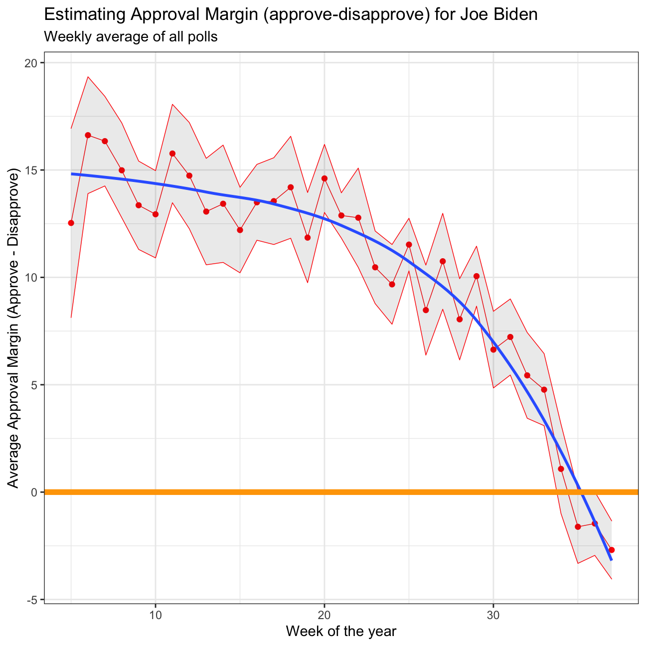
Inference 4: The confidence interval for ‘week 4’ ranges from 9.14 to 19.6828 with a mean of 14.41 and standard deviation of 10.25, while ‘week 25’ ranges from 10.30 to 12.7523 with a mean of 11.53 and a standard deviation of 4.74. This is mainly due to the number of data points. For ‘week 4’ we only have 17 data points to work with, while ‘week 25’ has 60. With a larger set of data to work with, we are able to create narrower intervals with the same level of confidence.
Analysis 3 on Excess rentals in TfL bike sharing
Loading and cleaning the latest Tfl data
setwd('/Users/purvasikri/Desktop/my_website/data')
url <- "https://data.london.gov.uk/download/number-bicycle-hires/ac29363e-e0cb-47cc-a97a-e216d900a6b0/tfl-daily-cycle-hires.xlsx"

# Download TFL data to temporary file
httr::GET(url, write_disk(bike.temp <- tempfile(fileext = ".xlsx")))
## Response [https://airdrive-secure.s3-eu-west-1.amazonaws.com/london/dataset/number-bicycle-hires/2021-08-23T14%3A32%3A29/tfl-daily-cycle-hires.xlsx?X-Amz-Algorithm=AWS4-HMAC-SHA256&X-Amz-Credential=AKIAJJDIMAIVZJDICKHA%2F20210917%2Feu-west-1%2Fs3%2Faws4_request&X-Amz-Date=20210917T192706Z&X-Amz-Expires=300&X-Amz-Signature=6c8905e47865b56bd813699936dbcbac103dbe2076c33fc594575c106565b775&X-Amz-SignedHeaders=host]
## Date: 2021-09-17 19:27
## Status: 200
## Content-Type: application/vnd.openxmlformats-officedocument.spreadsheetml.sheet
## Size: 173 kB
## <ON DISK> /var/folders/mz/jqgkzd1x5tb3pzzrn784dbkh0000gn/T//Rtmpv7pO5v/fileb60f6382fe1c.xlsx# Use read_excel to read it as dataframe
bike0 <- read_excel(bike.temp,
sheet = "Data",
range = cell_cols("A:B"))
# change dates to get year, month, and week
bike <- bike0 %>%
clean_names() %>%
rename (bikes_hired = number_of_bicycle_hires) %>%
mutate (year = year(day),
month = lubridate::month(day, label = TRUE),
week = isoweek(day))Graphs
# Clean the data
bike_exp <- bike %>%
  filter(year > 2015) %>% #Filter all the data that after 2015
  group_by(month) %>%
  summarise(expected_rentals=mean(bikes_hired)) # Calculate the expected rentals

# Replicate the first graph of actual and expected rentals for each month across years
plot <- bike %>%
  filter(year > 2015) %>%
  group_by(year, month) %>%
  summarise(actual_rentals=mean(bikes_hired)) %>% # Calculate the actual mean rentals for each month
  inner_join(bike_exp, by='month') %>% # Combine the data with original dataset
  mutate(
    up=if_else(actual_rentals > expected_rentals, actual_rentals - expected_rentals, 0),
    down=if_else(actual_rentals < expected_rentals, expected_rentals - actual_rentals, 0)) %>% # Create the up and down variable for plotting the shaded area using geom_ribbon
  ggplot(aes(x=month)) +
  geom_line(aes(y=actual_rentals, group=1), size=0.1, colour='black') +
  geom_line(aes(y=expected_rentals, group=1), size=0.7, colour='blue') + # Create lines for actual and expected rentals data for each month across years
  geom_ribbon(aes(ymin=expected_rentals, ymax=expected_rentals+up, group=1), fill='#7DCD85', alpha=0.4) +
  geom_ribbon(aes(ymin=expected_rentals, ymax=expected_rentals-down, group=1), fill='#CB454A', alpha=0.4) + # Create shaded areas and fill with different colors for up and down side
  facet_wrap(~year) + # Facet the graphs by year
  theme_bw() + # Theme
  labs(title="Monthly changes in TfL bike rentals", subtitle="Change from monthly average shown in blue and calculated between 2016-2019", x="", y="Bike rentals") +
  NULL


plot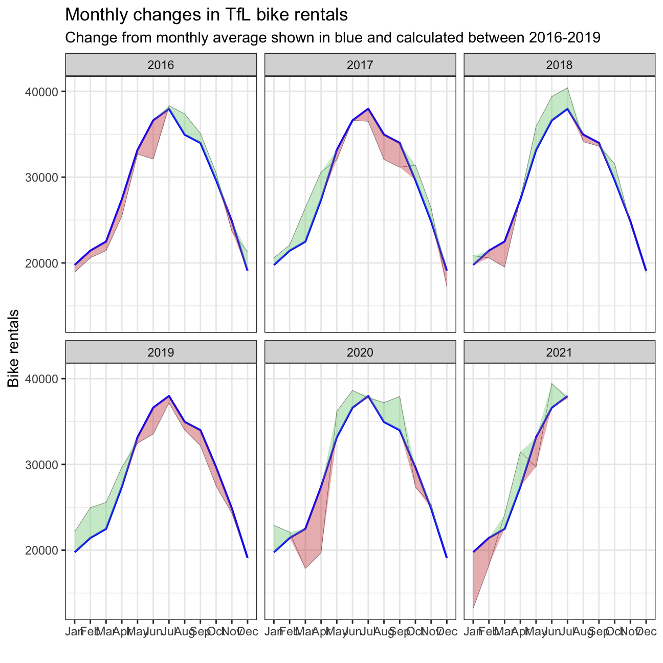
Percentage changes from the expected level of weekly rentals.
# Clean the data
bike_exp_week <- bike %>%
  filter(year > 2015) %>%
  mutate(week=if_else(month == 'Jan' & week == 53, 1, week)) %>% # Create week variable for the dataset
  group_by(week) %>%
  summarise(expected_rentals=mean(bikes_hired))

# Make the graph
plot <- bike %>%
  filter(year > 2015) %>%
  mutate(week=if_else(month == 'Jan' & week == 53, 1, week)) %>%
  group_by(year, week) %>%
  summarise(actual_rentals=mean(bikes_hired)) %>%
  inner_join(bike_exp_week, by='week') %>%
  mutate(
    actual_rentals=(actual_rentals-expected_rentals)/expected_rentals, #Calculate the excess rentals
    up=if_else(actual_rentals > 0, actual_rentals, 0),
    down=if_else(actual_rentals < 0, actual_rentals, 0), # Create the up and down variable for plotting the shaded area using geom_ribbon
    colour=if_else(up > 0, 'G', 'R')) %>% # Define the colors for up and down side
  ggplot(aes(x=week)) +
  geom_rect(aes(xmin=13, xmax=26, ymin=-Inf, ymax=Inf), alpha=0.005) +
  geom_rect(aes(xmin=39, xmax=53, ymin=-Inf, ymax=Inf), alpha=0.005) + # Add shaded grey areas for the according week ranges
  geom_line(aes(y=actual_rentals, group=1), size=0.1, colour='black') +
  geom_ribbon(aes(ymin=0, ymax=up, group=1), fill='#7DCD85', alpha=0.4) +
  geom_ribbon(aes(ymin=down, ymax=0, group=1), fill='#CB454A', alpha=0.4) + # Create shaded areas and fill with different colors for up and down
  geom_rug(aes(color=colour), sides='b') + # Plot rugs using geom_rug
  scale_colour_manual(breaks=c('G', 'R'), values=c('#7DCD85', '#CB454A')) +
  facet_wrap(~year) + # Facet by year
  theme_bw() + # Theme
  labs(title="Weekly changes in TfL bike rentals", subtitle="% change from weekly averages calculated between 2016-2019", x="week", y="") +
  NULL


plot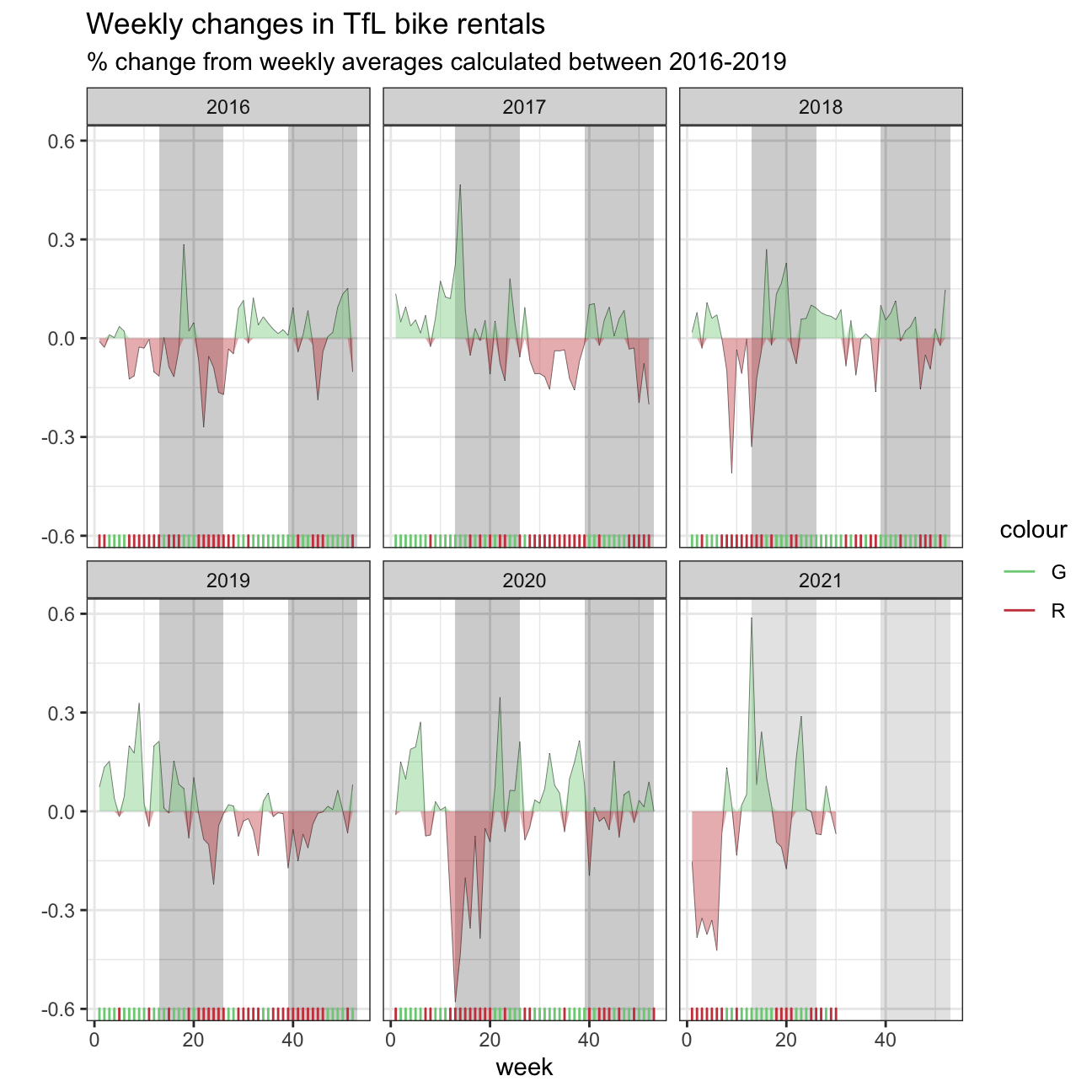
In collaborate with: Lazar Jelic, Valeria Morales, Hanlu Lin, Hao Ni, and Junna Yanai