EDA and Data Analysis

Setting up R to a default text and figure type
knitr::opts_chunk$set(
  message = FALSE,
  warning = FALSE,
  tidy=FALSE,     # display code as typed
  size="small")   # slightly smaller font for code
options(digits = 3)

# default figure size
knitr::opts_chunk$set(
  fig.width=6.75,
  fig.height=6.75,
  fig.align = "center"
)
Loading all the necessary packages
library(tidyverse)
library(mosaic)
library(ggthemes)
library(GGally)
library(readxl)
library(here)
library(skimr)
library(janitor)
library(broom)
library(tidyquant)
library(infer)
library(openintro)
library(RSQLite)
library(dbplyr)
library(DBI)
Performing an analysis on Youth Risk Behavior Surveillance
Every two years, the Centers for Disease Control and Prevention conduct the Youth Risk Behavior Surveillance System (YRBSS) survey, where it takes data from high schoolers (9th through 12th grade), to analyze health patterns. You will work with a selected group of variables from a random sample of observations during one of the years the YRBSS was conducted.
data(yrbss)
glimpse(yrbss)
## Rows: 13,583
## Columns: 13
## $ age <int> 14, 14, 15, 15, 15, 15, 15, 14, 15, 15, 15, 1…
## $ gender <chr> "female", "female", "female", "female", "fema…
## $ grade <chr> "9", "9", "9", "9", "9", "9", "9", "9", "9", …
## $ hispanic <chr> "not", "not", "hispanic", "not", "not", "not"…
## $ race <chr> "Black or African American", "Black or Africa…
## $ height <dbl> NA, NA, 1.73, 1.60, 1.50, 1.57, 1.65, 1.88, 1…
## $ weight <dbl> NA, NA, 84.4, 55.8, 46.7, 67.1, 131.5, 71.2, …
## $ helmet_12m <chr> "never", "never", "never", "never", "did not …
## $ text_while_driving_30d <chr> "0", NA, "30", "0", "did not drive", "did not…
## $ physically_active_7d <int> 4, 2, 7, 0, 2, 1, 4, 4, 5, 0, 0, 0, 4, 7, 7, …
## $ hours_tv_per_school_day <chr> "5+", "5+", "5+", "2", "3", "5+", "5+", "5+",…
## $ strength_training_7d <int> 0, 0, 0, 0, 1, 0, 2, 0, 3, 0, 3, 0, 0, 7, 7, …
## $ school_night_hours_sleep <chr> "8", "6", "<5", "6", "9", "8", "9", "6", "<5"…skim(yrbss) #To have a look at the descriptive statistics and check for missing values| Name | yrbss |
| Number of rows | 13583 |
| Number of columns | 13 |
| _______________________ | |
| Column type frequency: | |
| character | 8 |
| numeric | 5 |
| ________________________ | |
| Group variables | None |
Variable type: character
| skim_variable | n_missing | complete_rate | min | max | empty | n_unique | whitespace |
|---|---|---|---|---|---|---|---|
| gender | 12 | 1.00 | 4 | 6 | 0 | 2 | 0 |
| grade | 79 | 0.99 | 1 | 5 | 0 | 5 | 0 |
| hispanic | 231 | 0.98 | 3 | 8 | 0 | 2 | 0 |
| race | 2805 | 0.79 | 5 | 41 | 0 | 5 | 0 |
| helmet_12m | 311 | 0.98 | 5 | 12 | 0 | 6 | 0 |
| text_while_driving_30d | 918 | 0.93 | 1 | 13 | 0 | 8 | 0 |
| hours_tv_per_school_day | 338 | 0.98 | 1 | 12 | 0 | 7 | 0 |
| school_night_hours_sleep | 1248 | 0.91 | 1 | 3 | 0 | 7 | 0 |
Variable type: numeric
| skim_variable | n_missing | complete_rate | mean | sd | p0 | p25 | p50 | p75 | p100 | hist |
|---|---|---|---|---|---|---|---|---|---|---|
| age | 77 | 0.99 | 16.16 | 1.26 | 12.00 | 15.0 | 16.00 | 17.00 | 18.00 | ▁▂▅▅▇ |
| height | 1004 | 0.93 | 1.69 | 0.10 | 1.27 | 1.6 | 1.68 | 1.78 | 2.11 | ▁▅▇▃▁ |
| weight | 1004 | 0.93 | 67.91 | 16.90 | 29.94 | 56.2 | 64.41 | 76.20 | 180.99 | ▆▇▂▁▁ |
| physically_active_7d | 273 | 0.98 | 3.90 | 2.56 | 0.00 | 2.0 | 4.00 | 7.00 | 7.00 | ▆▂▅▃▇ |
| strength_training_7d | 1176 | 0.91 | 2.95 | 2.58 | 0.00 | 0.0 | 3.00 | 5.00 | 7.00 | ▇▂▅▂▅ |
Exploratory Data Analysis
yrbss_weight <- yrbss %>%
  select(weight) #selecting the weight column and allocating it

yrbss_weight %>%
  summary #checking the descriptive statistics of the weight
## weight
## Min. : 30
## 1st Qu.: 56
## Median : 64
## Mean : 68
## 3rd Qu.: 76
## Max. :181
## NA's :1004yrbss_weight %>%
ggplot(aes(x=weight)) +
geom_histogram(binwidth=5) +
labs(title="Histogram of weights", x="Weight", y="Count") +
NULL #plotting a histogram of the weights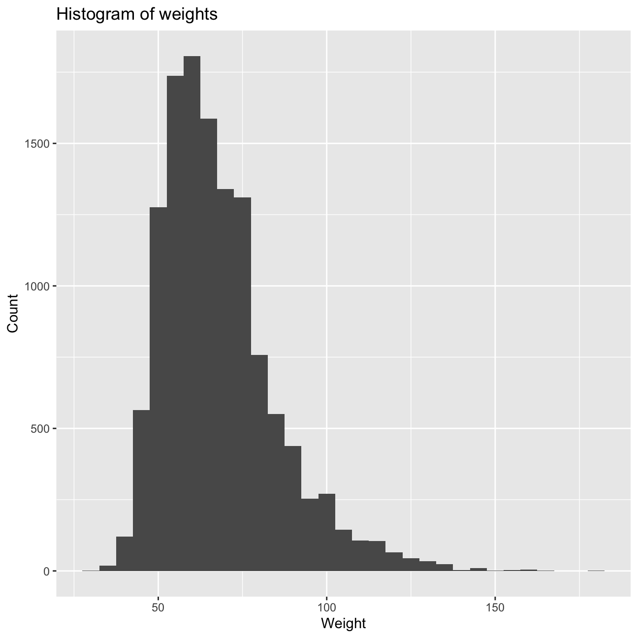
yrbss_weight %>%
  filter(is.na(weight)) %>%
  count() %>%
  paste('missing values') #tCounting the missing values in weight i.e. 1004 missing values
## [1] "1004 missing values"Summarising physical exercise data
yrbss <- yrbss %>%
  mutate(physical_3plus=if_else(physically_active_7d >= 3, 'yes', 'no'))
#making a new column titles physical_3plus if the person is active for more than 3 days a week

yrbss %>%
  filter(!is.na(physical_3plus)) %>% #removing the N.A.'s
  group_by(physical_3plus) %>%
  summarise(n=n()) %>%
  mutate(prop=round(n/sum(n), 3)) %>% #creating a new column for the proportion of physical_3plus
  arrange(-prop) #arranging the proportion in descending order
## # A tibble: 2 x 3
## physical_3plus n prop
## <chr> <int> <dbl>
## 1 yes 8906 0.669
## 2 no 4404 0.331yrbss %>%
filter(!is.na(physical_3plus)) %>% #removing the N.A.'s in physical_3plus
count(physical_3plus, sort=T) %>%
mutate(prop=round(n/sum(n), 3)) #getting the number and proportion of people active for more than 3 days## # A tibble: 2 x 3
## physical_3plus n prop
## <chr> <int> <dbl>
## 1 yes 8906 0.669
## 2 no 4404 0.331Calculating a confidence interval for the population proportion of high schools that are NOT active 3 or more days per week
yrbss %>%
  filter(!is.na(physical_3plus)) %>% #Removing the N.A.'s
  count(physical_3plus, sort=T) %>%
  mutate(prop=n/sum(n)) %>% #Finding the proportion
  filter(physical_3plus == 'no') %>%
  summarise(
    count=sum(n),
    se=sqrt(prop*(1-prop)/count), #getting the standard error (0.00709)
    t_critical=qt(0.975, count-1), #getting the t-critical value i.e. 1.96 (at 95% level)
    lower=prop-t_critical*se,
    upper=prop+t_critical*se) #getting the confidence interval (upper and lower CI)
## # A tibble: 1 x 5
## count se t_critical lower upper
## <int> <dbl> <dbl> <dbl> <dbl>
## 1 4404 0.00709 1.96 0.317 0.345Boxplot of physical_3plus vs. weight
yrbss %>%
  filter(!is.na(physical_3plus)) %>% #Removing the NA's
  ggplot(aes(x=physical_3plus, y=weight)) +
  geom_boxplot() + #box plot of weights for people that are active for more or less than 3 days
  labs(title="Relationship between exercise frequency and weight", x="Exercise at least 3 days per week?", y="Weight") +
  NULL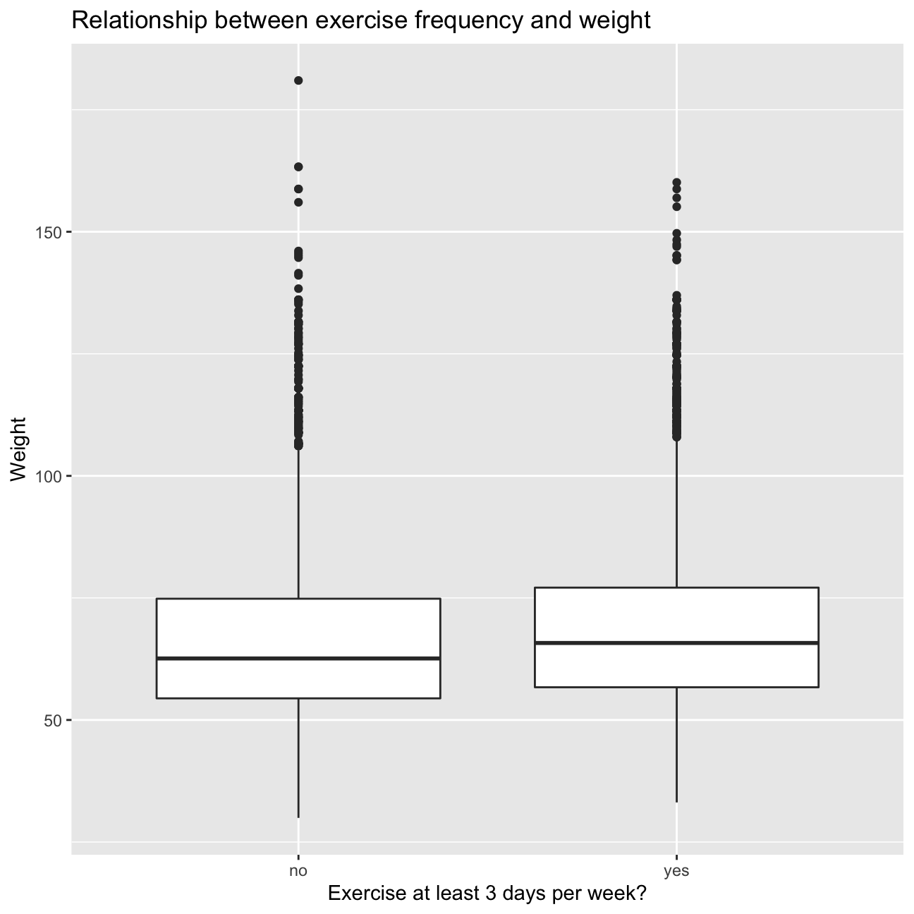
Inference 1 Although, the weights of the people that exercise more or less than 3 days appear to be familiar, there is a relationship between the level of physical activity and respective weight. Weight appears to be more clustered for the people that exercise over 3 days and there are evidently more outliers (higher weight) for the people exercising less than 3 days. Therefore, we infer that exercising is helpful in maintaining weight. Nonetheless, it is important to keep in mind that there are some people that do weight training to put on muscle (in tuen increasing weight), weights may not be the best indicator of fitness.
Calculating the confidence Interval
yrbss %>%
  filter(!is.na(physical_3plus)) %>% #Removing the NA's
  group_by(physical_3plus) %>% #grouping by the people that exercise for more than 3 days
  summarise(
    mean=mean(weight, na.rm=T), #finding the descriptive statistics
    sd=sd(weight, na.rm=T),
    count=n(),
    se=sd/sqrt(count), #finding the standard error, t critical value, and confidence interval
    t_critical=qt(0.975, count-1),
    lower=mean-t_critical*se,
    upper=mean+t_critical*se)
## # A tibble: 2 x 8
## physical_3plus mean sd count se t_critical lower upper
## <chr> <dbl> <dbl> <int> <dbl> <dbl> <dbl> <dbl>
## 1 no 66.7 17.6 4404 0.266 1.96 66.2 67.2
## 2 yes 68.4 16.5 8906 0.175 1.96 68.1 68.8There is an observed difference of about 1.77kg (68.44 - 66.67), and we notice that the two confidence intervals do not overlap. It seems that the difference is at least 95% statistically significant. Let us also conduct a hypothesis test.
Hypothesis testing
Null: There is no difference in weight means between people who are active more than or less than 3 days per week. Alternative: There is a difference in weight means between people who are active more than or less than 3 days per week.
t.test(weight ~ physical_3plus, data = yrbss) ##
## Welch Two Sample t-test
##
## data: weight by physical_3plus
## t = -5, df = 7479, p-value = 9e-08
## alternative hypothesis: true difference in means is not equal to 0
## 95 percent confidence interval:
## -2.42 -1.12
## sample estimates:
## mean in group no mean in group yes
## 66.7 68.4#Running a t-test to check for the relation between weight and physical activityHypothesis test with infer
obs_diff <- yrbss %>%
  specify(weight ~ physical_3plus) %>%
  calculate(stat = "diff in means", order = c("yes", "no")) #initialising the test
Hypothesis testing for difference in means using bootstrapping
null_dist <- yrbss %>%
  # specify variables
  specify(weight ~ physical_3plus) %>%

  # assume independence, i.e, there is no difference
  hypothesize(null = "independence") %>%

  # generate 1000 reps, of type "permute"
  generate(reps = 1000, type = "permute") %>%

  # calculate statistic of difference, namely "diff in means"
  calculate(stat = "diff in means", order = c("yes", "no"))
Visualizing this null distribution
ggplot(data = null_dist, aes(x = stat)) +
  geom_histogram() + #Histogram for the null distribution
  labs(title="Histogram for null distribution", x="Difference in means", y="Count") +
  NULL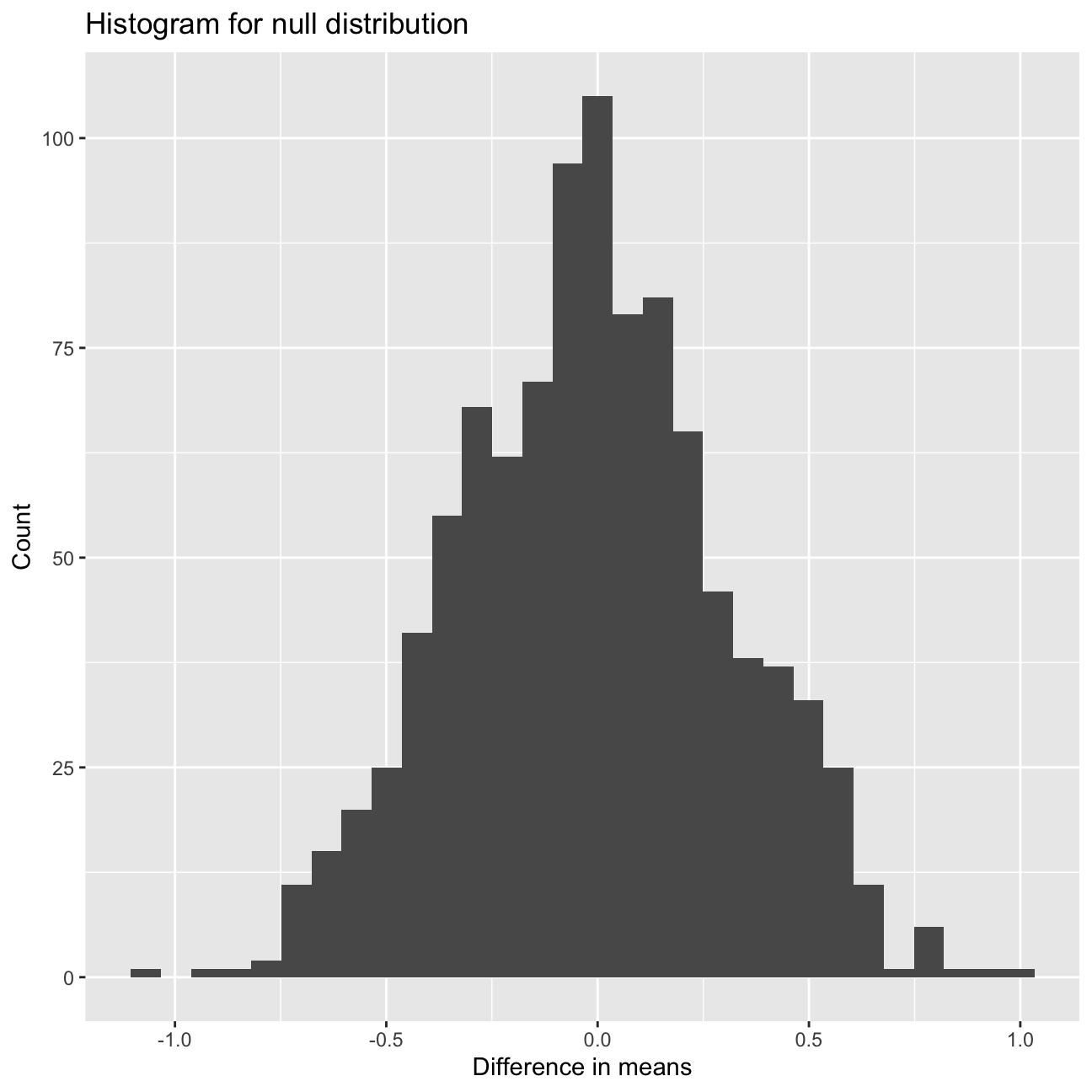
Calculating the p-value for your hypothesis test using the function infer::get_p_value().
null_dist %>% visualize() +
  #visualizing and shading for the p-value of our hypothesis
shade_p_value(obs_stat = obs_diff, direction = "two-sided") 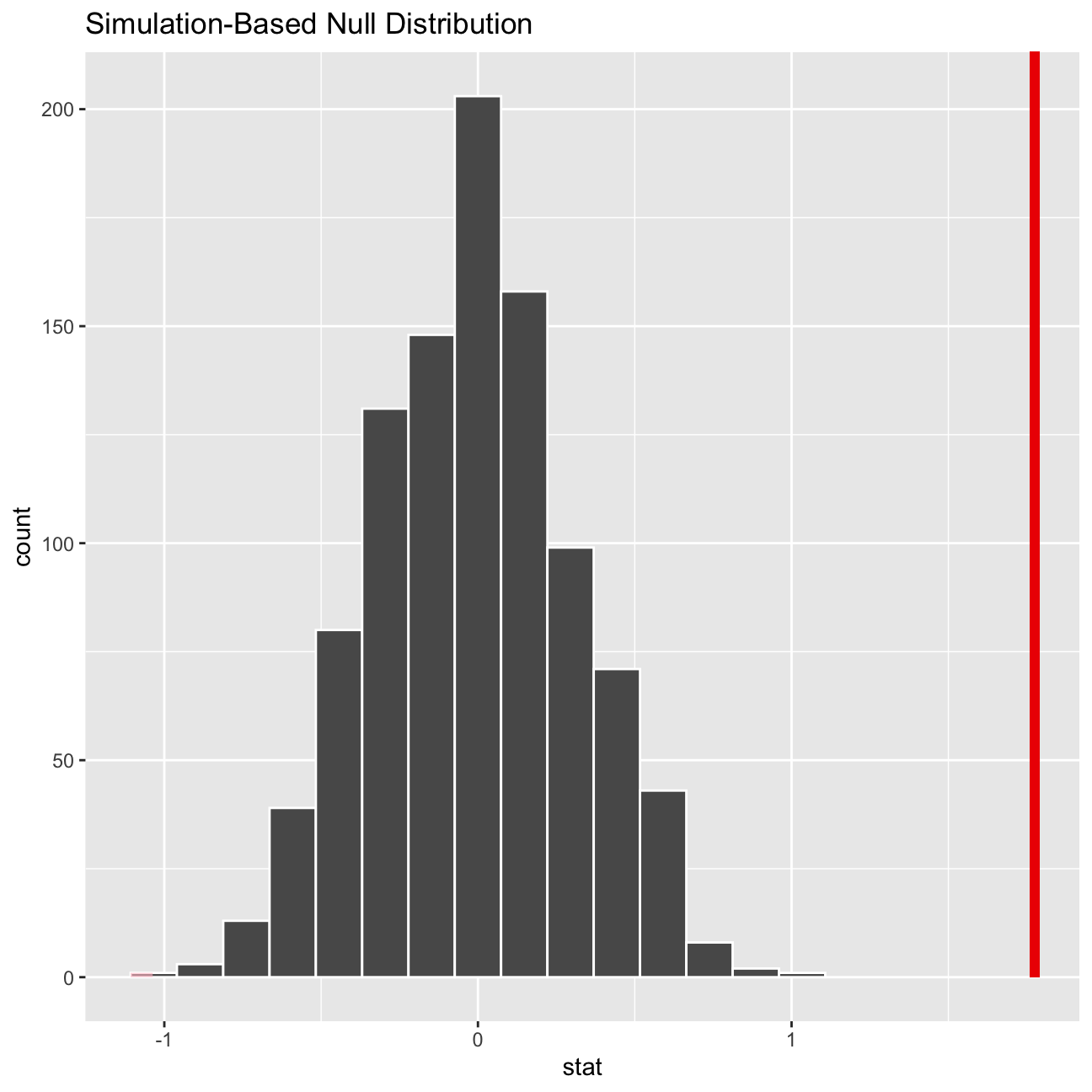
null_dist %>%
  #calculating the p-value for our hypothesis
  get_p_value(obs_stat = obs_diff, direction = "two_sided")
## # A tibble: 1 x 1
## p_value
## <dbl>
## 1 0Analysis 2 on IMDB ratings: Differences between directors
\(H_0: \mu_a - \mu_b == 0\) (HO: mean of Steven Spielberg rating - mean of Tim Burton = 0) \(H_a: \mu_a - \mu_b != 0\) (HA: mean of Steven Spielberg rating - mean of Tim Burton != 0) P-value: 0.01 t-statistic: 3
Since the t-statistic is greater than 2 and p value is less than 0.05, it means that we can reject the null Hypothesis that the mean ratings for both Steven and Tim are the same.
movies <- read_csv(here::here("data", "movies.csv"))
glimpse(movies) #exploring the dataset
## Rows: 2,961
## Columns: 11
## $ title <chr> "Avatar", "Titanic", "Jurassic World", "The Avenge…
## $ genre <chr> "Action", "Drama", "Action", "Action", "Action", "…
## $ director <chr> "James Cameron", "James Cameron", "Colin Trevorrow…
## $ year <dbl> 2009, 1997, 2015, 2012, 2008, 1999, 1977, 2015, 20…
## $ duration <dbl> 178, 194, 124, 173, 152, 136, 125, 141, 164, 93, 1…
## $ gross <dbl> 7.61e+08, 6.59e+08, 6.52e+08, 6.23e+08, 5.33e+08, …
## $ budget <dbl> 2.37e+08, 2.00e+08, 1.50e+08, 2.20e+08, 1.85e+08, …
## $ cast_facebook_likes <dbl> 4834, 45223, 8458, 87697, 57802, 37723, 13485, 920…
## $ votes <dbl> 886204, 793059, 418214, 995415, 1676169, 534658, 9…
## $ reviews <dbl> 3777, 2843, 1934, 2425, 5312, 3917, 1752, 1752, 35…
## $ rating <dbl> 7.9, 7.7, 7.0, 8.1, 9.0, 6.5, 8.7, 7.5, 8.5, 7.2, …Comparing directors by ratings of their movies
directors <- c('Tim Burton', 'Steven Spielberg')

movies %>%
  filter(director %in% directors) %>% #only keeping Tim Burton and Steven Spielberg
  select(director, rating) %>%
  group_by(director) %>%
  #selecting only the director and ratings then further grouping by director
  summarise(mean_rating = mean(rating),
            median_rating = median(rating),
            sd_rating = sd(rating),
            count = n(),
            t_critical = qt(0.975, count-1),
            se_rating = sd_rating/sqrt(count),
            margin_of_error = t_critical * se_rating,
            rating_low = mean_rating - margin_of_error,
            rating_high = mean_rating + margin_of_error) %>%
  #getting the descriptive statistics, standard error, t-critical value, margin of error, and confidence interval
  mutate(
    xmin=max(rating_low),
    xmax=min(rating_high)) %>%
  #creating a plot of the mean rating of various directors and differentiating by the colors
  ggplot(aes(x=mean_rating, y=factor(director, level=directors), colour=director)) +
  #creating a scatter plot
  geom_point() +
  geom_errorbarh(aes(xmin=rating_low, xmax=rating_high), width=0.1, size=2) +
  geom_rect(aes(xmin=xmin, xmax=xmax, ymin=-Inf, ymax=Inf, alpha=0.05)) +
  #adding text on the rectangle
  annotate('text', x=6.53, y=directors[1], label="6.53") +
  annotate('text', x=6.93, y=directors[1], label="6.93") +
  annotate('text', x=7.33, y=directors[1], label="7.33") +
  annotate('text', x=7.27, y=directors[2], label="7.27") +
  annotate('text', x=7.57, y=directors[2], label="7.57") +
  annotate('text', x=7.87, y=directors[2], label="7.87") +
  #adding title, subtitle, and the description of x and y axis
  labs(x="Mean IMDB Rating",
       y="",
       title="Do Speilberg and Burton have the same mean IMDB ratings?",
      subtitle="95% confidence intervals overlap") +
  theme_bw() +
  theme(legend.position='none') +
  #removing the legend
  NULL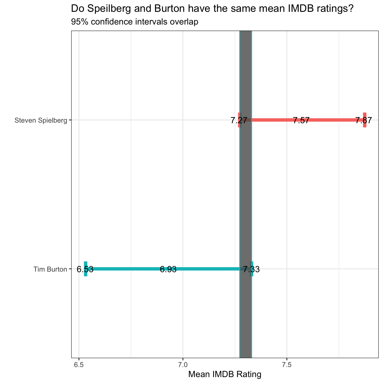
Analysis 3 on Omega Group plc- Pay Discrimination
Loading the data
omega <- read_csv(here::here("data", "omega.csv"))
glimpse(omega) #Exploring the omega dataset
## Rows: 50
## Columns: 3
## $ salary <dbl> 81894, 69517, 68589, 74881, 65598, 76840, 78800, 70033, 635…
## $ gender <chr> "male", "male", "male", "male", "male", "male", "male", "ma…
## $ experience <dbl> 16, 25, 15, 33, 16, 19, 32, 34, 1, 44, 7, 14, 33, 19, 24, 3…Relationship Salary - Gender ?
# Summary Statistics of salary by gender
mosaic::favstats(salary ~ gender, data=omega)
## gender min Q1 median Q3 max mean sd n missing
## 1 female 47033 60338 64618 70033 78800 64543 7567 26 0
## 2 male 54768 68331 74675 78568 84576 73239 7463 24 0# Dataframe with two rows (male-female) and having as columns gender, mean, SD, sample size,
# the t-critical value, the standard error, the margin of error,
# and the low/high endpoints of a 95% condifence interval
omega %>%
group_by(gender) %>%
summarise(
mean=mean(salary),
sd=sd(salary),
count=n(),
se=sd/sqrt(count),
t_critical=qt(0.975, count-1),
lower=mean-t_critical*se,
upper=mean+t_critical*se) %>%
as.data.frame()## gender mean sd count se t_critical lower upper
## 1 female 64543 7567 26 1484 2.06 61486 67599
## 2 male 73239 7463 24 1523 2.07 70088 76390Inference 2 Evidently, the mean salary for females is lower than that of males, but the variation for both the gender’s is similar i.e. there is not a huge gap in the salary levels within each gender. Additionally, since the t-critical value is greater than 2, with 95% level of confidence, we can reject our null hypothesis that mean salary of males subtracted from the mean salary of females is zero (it is also worthwhile to notice that the confidence intervals do not overlap). You can also run a hypothesis testing, assuming as a null hypothesis that the mean difference in salaries is zero, or that, on average, men and women make the same amount of money. You should tun your hypothesis testing using
t.test()and with the simulation method from theinferpackage.
Hypothesis testing for salary difference between genders
# hypothesis testing using t.test()
t.test(salary ~ gender, data=omega)
##
## Welch Two Sample t-test
##
## data: salary by gender
## t = -4, df = 48, p-value = 2e-04
## alternative hypothesis: true difference in means is not equal to 0
## 95 percent confidence interval:
## -12973 -4420
## sample estimates:
## mean in group female mean in group male
## 64543 73239# hypothesis testing using infer package
obs_diff <- omega %>%
specify(response=salary) %>%
calculate(stat='mean')
omega %>%
specify(salary ~ gender) %>%
hypothesize(null='independence') %>%
generate(reps=1000, type='permute') %>%
calculate(stat='diff in means', order=c('female', 'male')) %>%
get_p_value(obs_stat=obs_diff, direction='both')## # A tibble: 1 x 1
## p_value
## <dbl>
## 1 0Inference 3: The p-value from the t-test is 0.0002 and from get_p_value is 0 (which is much lesser than the hurdle of 0.05). Therefore with 95% level of confidence, we can reject the null hypothesis that the mean difference in salaries is 0. Further, since this p-value seems improbable, it may be worthwhile to consider if there are floating-point numbers or there has been omission of important data points.
Relationship Experience - Gender?
# Summary Statistics of salary by gender
favstats(experience ~ gender, data=omega)
## gender min Q1 median Q3 max mean sd n missing
## 1 female 0 0.25 3.0 14.0 29 7.38 8.51 26 0
## 2 male 1 15.75 19.5 31.2 44 21.12 10.92 24 0t.test(experience ~ gender, data=omega)##
## Welch Two Sample t-test
##
## data: experience by gender
## t = -5, df = 43, p-value = 1e-05
## alternative hypothesis: true difference in means is not equal to 0
## 95 percent confidence interval:
## -19.35 -8.13
## sample estimates:
## mean in group female mean in group male
## 7.38 21.12Inference 4: This p-value below 0.05 suggests that at 95% confidence level we can reject the null hypothesis that the mean difference between the work experience of males and females is 0. This finding definately endangers our earlier assumption that the difference in mean salaries of males and females is due to some inherent bias (gender disparity at workplace). However, after this analysis we can say that one of the reasons for lower salaries of females is the lesser work experience as comapred to that of men (a case of correlation not causation).
Relationship Salary - Experience ?
#making a scatter plot of the experience and salary of employees
omega %>%
  ggplot(aes(x=experience, y=salary)) +
  geom_point() +
  geom_smooth(se=F) +
  NULL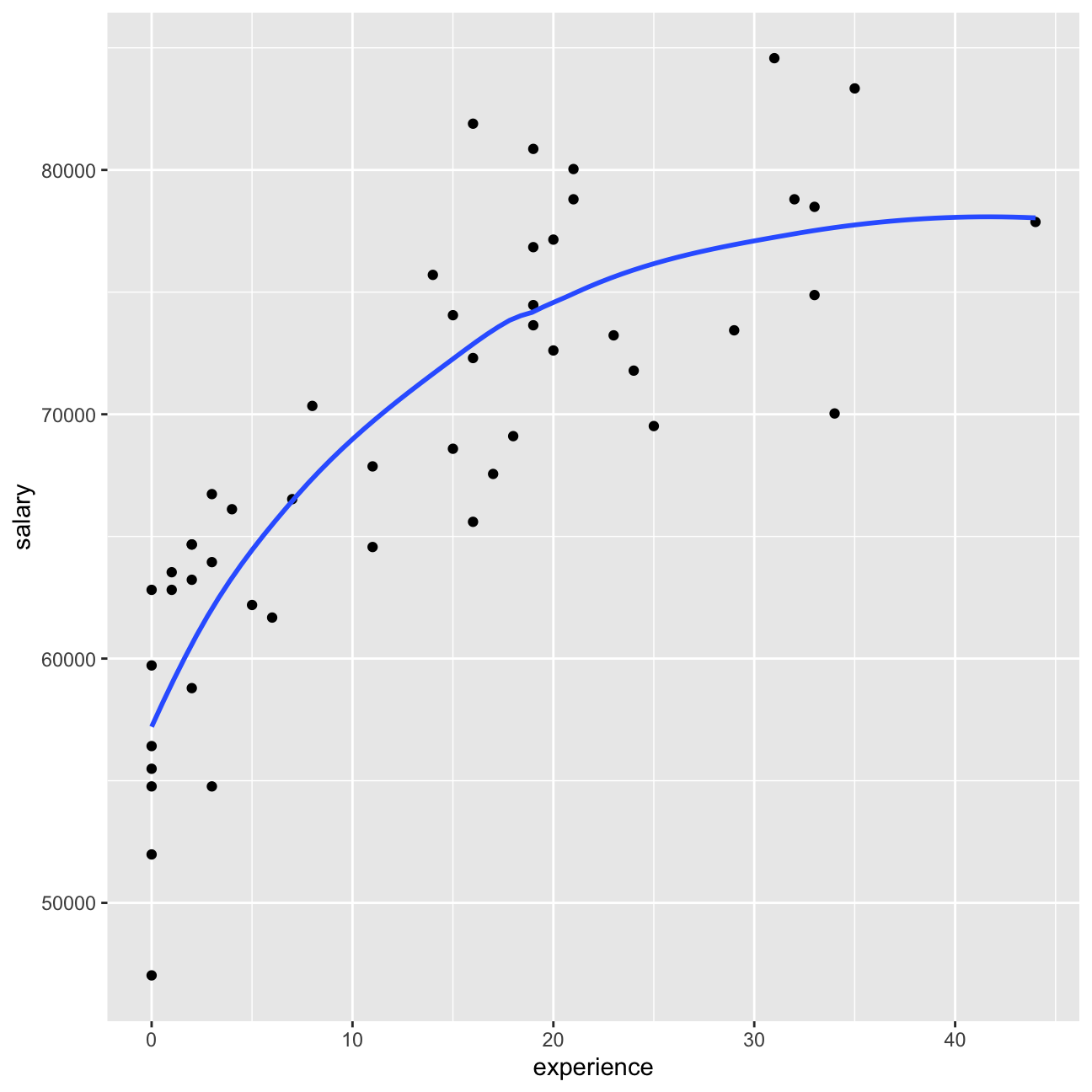
Checking the correlations between the data
#creating a correlation matrix to see the relationship between experience and salary seperately for men and women
omega %>%
  select(gender, experience, salary) %>%
  ggpairs(aes(colour=gender, alpha = 0.3)) +
  theme_bw()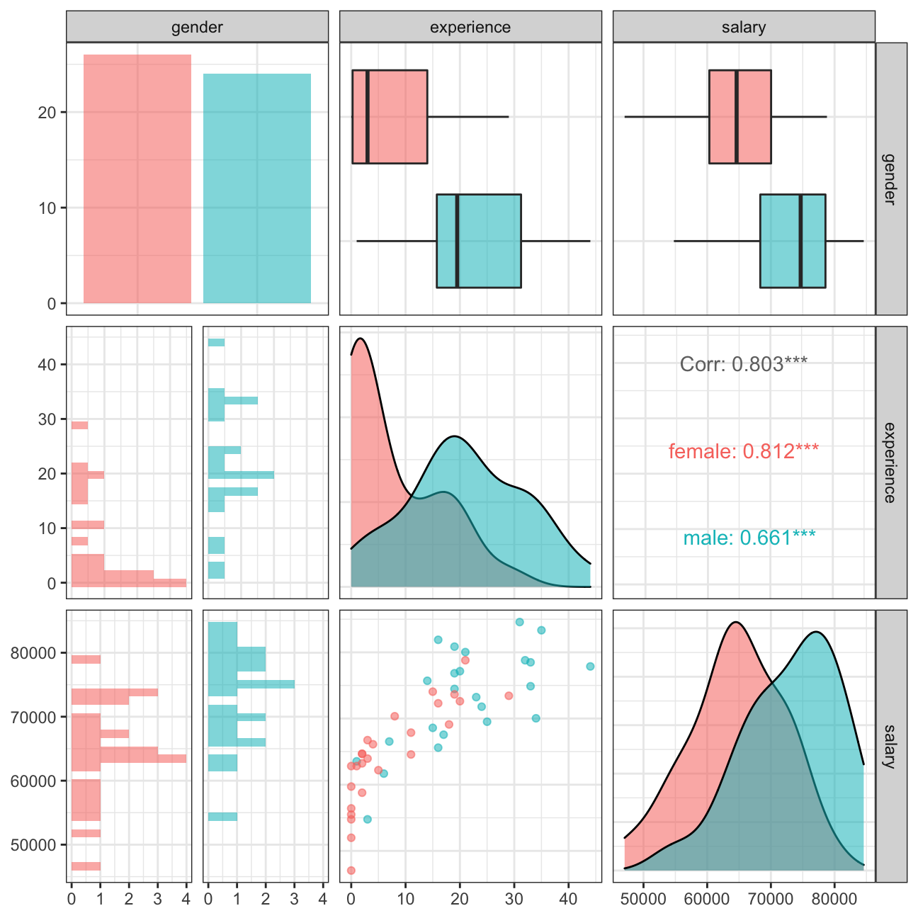
Inference 5: On a closer look, some of the possible inferencs are: 1. The feamles appear to be at the lower level of jobs (interns, junior managers, etc) whereas the top managament is clustered with male. 2. Concievably, the correlation between salary and experience is more for the females than males i.e. despite lesser work experience it is possible for males to have higher paying jobs.
Analysis 4 on the Brexit data
brexit <- read_csv(here::here('data', 'brexit_results.csv'))
glimpse(brexit) #exporing the brexit data frame
## Rows: 632
## Columns: 11
## $ Seat <chr> "Aldershot", "Aldridge-Brownhills", "Altrincham and Sale W…
## $ con_2015 <dbl> 50.6, 52.0, 53.0, 44.0, 60.8, 22.4, 52.5, 22.1, 50.7, 53.0…
## $ lab_2015 <dbl> 18.3, 22.4, 26.7, 34.8, 11.2, 41.0, 18.4, 49.8, 15.1, 21.3…
## $ ld_2015 <dbl> 8.82, 3.37, 8.38, 2.98, 7.19, 14.83, 5.98, 2.42, 10.62, 5.…
## $ ukip_2015 <dbl> 17.87, 19.62, 8.01, 15.89, 14.44, 21.41, 18.82, 21.76, 19.…
## $ leave_share <dbl> 57.9, 67.8, 38.6, 65.3, 49.7, 70.5, 59.9, 61.8, 51.8, 50.3…
## $ born_in_uk <dbl> 83.1, 96.1, 90.5, 97.3, 93.3, 97.0, 90.5, 90.7, 87.0, 88.8…
## $ male <dbl> 49.9, 48.9, 48.9, 49.2, 48.0, 49.2, 48.5, 49.2, 49.5, 49.5…
## $ unemployed <dbl> 3.64, 4.55, 3.04, 4.26, 2.47, 4.74, 3.69, 5.11, 3.39, 2.93…
## $ degree <dbl> 13.87, 9.97, 28.60, 9.34, 18.78, 6.09, 13.12, 7.90, 17.80,…
## $ age_18to24 <dbl> 9.41, 7.33, 6.44, 7.75, 5.73, 8.21, 7.82, 8.94, 7.56, 7.61…#converting the table to a longer format so as to male a scatter plot with a trend line for each of the patrties
plot <- brexit %>%
pivot_longer(cols=2:5, names_to='party_name', values_to='party_pct') %>%
ggplot(aes(x=party_pct, y=leave_share, colour=party_name)) +
theme_bw() +
geom_point(alpha=0.25) +
geom_smooth(method='lm', size=0.5) +
#adding a different colour to the trend lines and points of each party
scale_colour_manual(
labels = c('Conservative', 'Labour', 'Lib Dems', 'UKIP'),
values=c('#0087dc', '#d50000', '#fdbb30', '#efe600')) +
#Position he legend at the bottom
theme(legend.position='bottom', legend.title=element_blank()) +
labs (
title = "How political affiliation translated to Brexit Voting",
x = "Party % in the UK 2015 general election",
y = "Leave % in the 2016 Brexit referendum") +
NULL
plot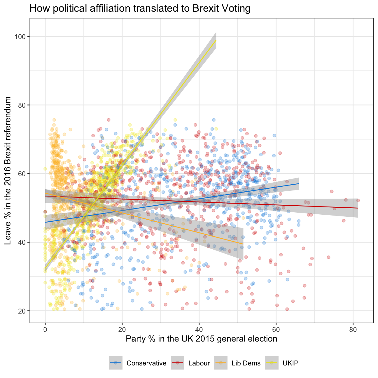
In collaboration with Lazar Jelic, Valeria Morales, Hanlu Lin, Hao Ni,and Junna Yanai